A responsive school website – from front to back
A responsive school website – from front to back
A responsive school website – from front to back

Your school website is your front door, it is often the first impression you create. A large number of school websites are still missing one absolutely essential ingredient. More and more people are accessing your school website on more and more devices. This article discusses just how vital it is to have a mobile friendly, responsive school website design.
Responsive school website stats – they don’t lie
Every year we analyse the use of every school website we’ve built from the ground up and every year we see an increasing trend. It’s one that you can’t ignore.
Go back just 12 months or so and the percentage of users viewing school websites on smartphones and tablets was around 45% across the board. As of April 2017 the stats have changed. Across the board we’re much more likely to see average mobile and tablet usage rates of 55-60%.
The hard truth is that if you’re trying to engage your wider school community with a non-responsive website, you’re fighting a losing battle. That’s why it’s so important to have a mobile friendly school website.
Your responsive school website – the front end
Given that such an enormous percentage of people who want to know more about your school are looking on mobile devices, it’s absolutely vital to get a few things right. It isn’t beyond any budget or the capability of any school to have a mobile friendly school website.
Firstly, your website should be ‘fully responsive’.
That means that, no matter what device a visitor uses, it will work well and be easy to use. It means that your content (the most important part of any website) will be readable and engaging no matter what. It means that you reach your audience where they’re at.
When an OFSTED inspector asks how you’re engaging your school community, you can answer with confidence. “We have a website with every element accessible on any device,” amongst other things (like a Free School App and a fully OFSTED compliant website!)
If your website isn’t responsive, at least half of your website visitors won’t be able to view your website properly. That means they won’t come back. The result of that is that you’re failing to engage.
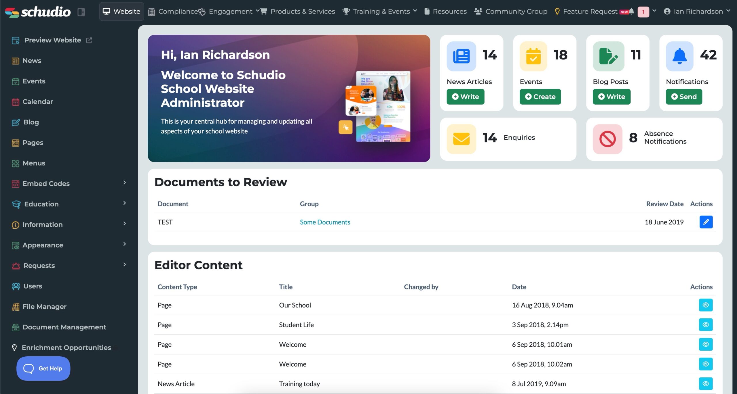
Your responsive school website – the back end (the software!)
But what about the ‘back end’? What about the software that powers your website? We first started talking to schools about their websites years ago. The conversation went something like this: “our website is dated and tired, but most of all, it’s just so difficult to update.”
Hundreds of school websites later and we’re still having the same conversations. “It looks pretty good, but it’s a nightmare to upload photos,” or “it takes me an hour to add a newsletter.”
The truth is, your school website partner shouldn’t be just another agency or just another software company. Partners should be dedicated experts in their field. They should also have their own software that backs up their arguments. They should literally put their money where their mouth is and invest it in dedicated software.
A great mobile friendly school website is powered by software that is fully responsive. So, while the front end of your website needs to be mobile friendly to attract your audience, your software should be mobile friendly to make it easier to use.
Lots of schools all over the UK are using the Schudio school website software on iPads (other tablets are of course available!) to publish content effectively. Imagine sitting in class or an assembly and being able to take a photo, write a short piece and publish the article instantly. Imagine uploading a number of photos into a gallery on your iPad in seconds to bring your latest news article to life.
A great school website provider will provide all these options and more.
Getting ahead of the competition
The other thing to bear in mind is that for many schools these days, competition can be fierce. Sadly, that means you need to be effective at promoting your school online. A mobile friendly school website is an essential part of your toolkit.
