Presenting Your Curriculum
Presenting Your Curriculum
Presenting Your Curriculum

Curriculum
For most schools publishing the curriculum is a statutory requirement. But, Even if it’s not a requirement for your school, it’s still a good idea to publish it. Parents or other visitors to your website can then easily find out what is being taught at your school, and when in the term.
How to best present your curriculum?
Easy to navigate curriculum
 Think about the structure of your curriculum area. One page with curriculum information on is likely to be an information overload. Not all curriculum information for all stages/levels will be relevant. Breaking your curriculum down by level, year group or key stage is a good structure to adopt. It allows for a clear break in the different information required for each stage. It’s also going to be easier for parents and other visitors to navigate. Once the right year/stage is selected all the relevant information is available.
After the stage/level split, the information can then be split by subject or course. This should allow users of your website to easily find the information they’re looking for.
There should also be menu options within a curriculum page to allow easy access to other curriculum information. If you’re a user of the Schudio CMS you can also use tags to show content related to a curriculum item, for an even greater level of personalisation and supporting content to be displayed around your curriculum information.

 Clearly explained curriculum
All the information in the curriculum section should be clear. Ideally your content will be split into appropriate headings that help to divide it up and increase readability. Using the different heading formatting (Heading 2, Heading 3 etc.) styles helps to give a consistent look and feel through all the different pages (This is good practice for the whole of your website). Inserting different media into your content can helpfully break up the text, and also enhance your content. Photos work really well for this, and if you do have suitable video content, that can work even better.
Good examples for presenting your curriculum
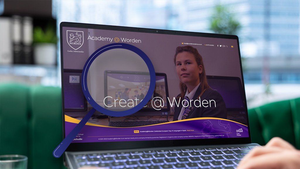
There are lots of websites displaying their curriculum really well, but I’ve highlighted below the examples that have been used as screenshots in this post so you can see their website and check their implementation actually on the website.
If you think your website presents the curriculum really well, please get in touch, include your website address and we’ll take a look at your site. Alternatively if you’re not happy with the way your current website displays your curriculum information get in touch with us and we’ll be happy to show you our system, and how you can use it to present better content.


