Why Your School Website Must Be Responsive (+ what is Responsive Design??)
Why Your School Website Must Be Responsive (+ what is Responsive Design??)
Why Your School Website Must Be Responsive (+ what is Responsive Design??)

If you’re looking into updating your school website you may well have heard the term Responsive Design. It’s entirely possible that you’re wondering what on earth that means so, first things first …
What is responsive design?
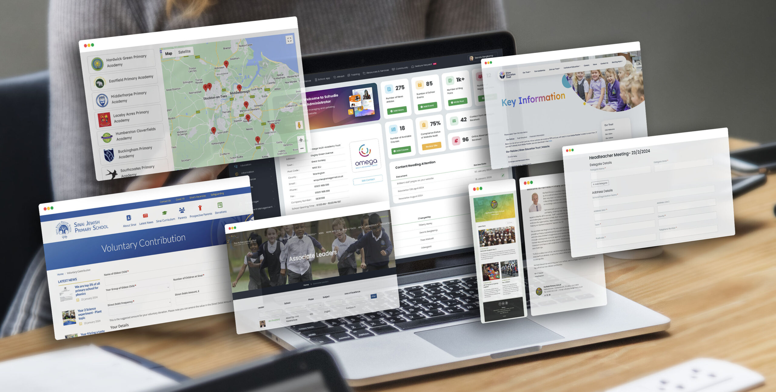
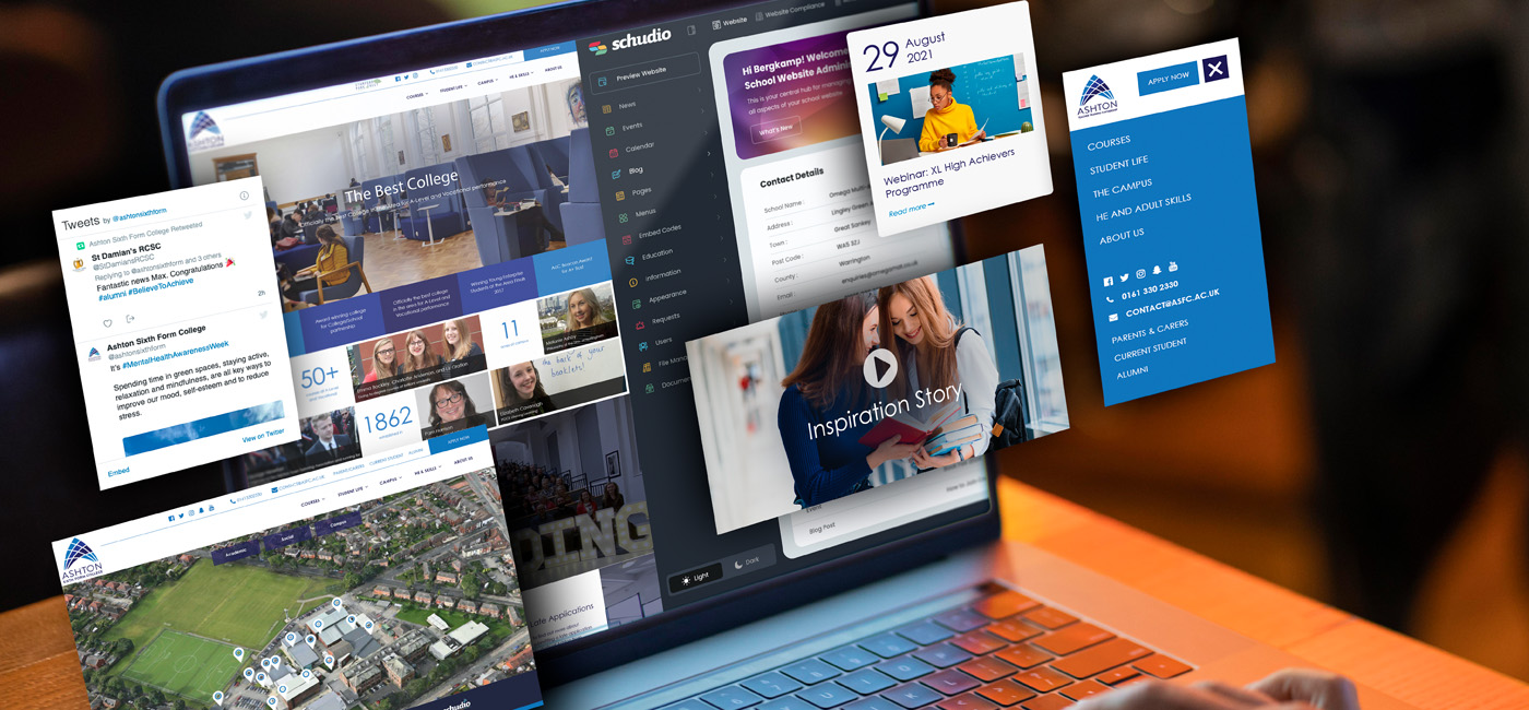
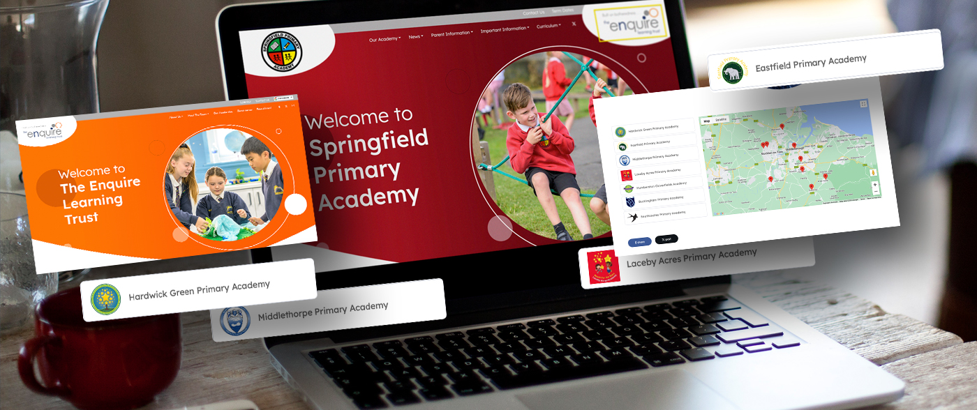
Responsive design automatically crafts your website to look good on every device, whether that is a desktop, laptop, tablet or phone. The technology cleverly resizes, reorders, hides or moves the content to ensure that all your content is easy to read on every device and give the user the best possible experience.
Why your school website must be responsive
First and foremost your school website is one of the most powerful tools you have at your disposal to effectively communicate all that you are to the wider community around you. Through your school website you can meet prospective parents and students as well as your current school community right where they are, wherever they are.
If your website is difficult to read on a mobile device of some kind you have lost them before you have even begun and getting them back is nigh on impossible.
Users leave your website when they don’t get what they expect
Every visitor to your website is expecting to be able to engage with your content easily and any barriers that are in the way of that will have a big impact on how they engage with your website. For example, if the menu is difficult to use on my phone, I will get frustrated very quickly and look elsewhere.
The impact if users are shopping online is that an online business will lose their trade if the website is too difficult to use but because they are in need of buying something they will look elsewhere. If a prospective parent is looking at schools in your area they most likely already have some idea of which schools they are interested in. The danger is that you will lose their interest entirely at the first hurdle if they can’t use your website easily.
OFSTED says you need a responsive website
They don’t actually say it in those words but look where this is heading … “In the interests of transparency, a governing body
should publish on its website up-to-date details of its governance arrangements in a readily accessible form.” According to the DfE ‘readily accessible form’ means “that the information should be on a webpage without the need to download or
open a separate document.”
We’ve lost count of how many schools are using lots and lots of Word docs and PDFs for this kind of content when we’re transferring all their content as part of our standard package, so it’s clear there is an issue here. But our concern is that schools can potentially cause themselves an issue if this content is buried in documents on a website that are hard to find because the website is just so hard to use on a tablet or phone.
How long is it before ‘readily accessible form’ becomes ‘… on any device’? We’re not sure it’s a million miles away, especially when you consider the next point.
Nearly half of all users are on a mobile device
Believe it or not almost half of all visits to your website will be on a mobile device. Plus, if your users know you have a website that works on a mobile or a tablet then this number is even higher! The evidence is there; if you have a responsive website then your users will come back to your website more often and stay on your website for longer.
The prime aim of your school website is to give users the information that they need and attract new students to your school.
You simply cannot reach your audience to your maximum potential unless you have a website that is easy to use and looks great on every device.
Whoever you are using for your school website, talk to them about responsive design and how you can make sure you aren’t missing out. Every site we build is responsive and is packed full of powerful features to empower you to reach the people that are using your website highly effectively.
