Horizontal Descriptions – Advancing Your Website
Horizontal Descriptions – Advancing Your Website

What are Horizontal Descriptions ?
Horizontal Descriptions are a class available in the responsive framework that can be applied to change the appearance and behaviour of content.
Every website we build at Schudio is responsive, each website responds to the size of the device trying to view it. This ensures each visitor to your site has the best experience possible, regardless of the technology they use to engage with you.
We use the responsive framework Bootstrap, it’s one of the most popular frameworks used on the web. There are a large range of styles available within bootstrap. Lots of these styles are included throughout the design of our websites. But sometimes the best place to use these styles is within the content itself, and that’s where we can get creative. We do need to edit the code of the page to apply these styles so it’s a little more advanced than simply adding content in the way the majority of users do. But it’s still quite straightforward.
The different styles within a website are referred to as classes. We’re going to look at the Horizontal Description Class.
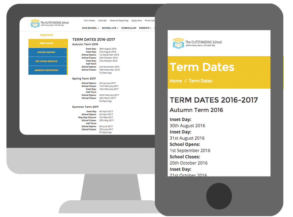
Horizontal Descriptions allows the display of content in a list with headings and descriptions displayed side by side on wider displays, and on a narrow display automatically stacks the display of the list so each section title sits above the description uniformly.

How to add Horizontal Descriptions?
To apply this we need to go to the code view of our page.
The code that needs to be added is as follows:
<dl class="dl-horizontal">
<dt>...</dt>
<dd>...</dd>
</dl>
<dl class=”dl-horizontal”> Opens the class or style and the </dl> at the end closes it.
In between this is are the <dt> and <dd> tags.
<dt> stands for Description Title and <dd> Description Description
Keep adding <dt> and <dd> tags for each title and description line just make sure they are higher in the code than the </dl> tag.
Anything added in between the open and close tags for title or description will be output on the page.
Below is the code used for the example screenshot above.
<h3>TERM DATES 2016-2017</h3> <h4>Autumn Term 2016</h4> <dl class="dl-horizontal"> <dt>Inset Day:</dt> <dd>30th August 2016</dd> <dt>Inset Day:</dt> <dd>31st August 2016</dd> <dt>School Opens:</dt> <dd>1st September 2016</dd> <dt>School Closes:</dt> <dd>20th October 2016</dd> <dt>Inset Day:</dt> <dd>21st October 2016</dd> <dt>Half Term</dt> <dd> </dd> <dt>School Opens:</dt> <dd>2nd November 2016</dd> <dt>School Closes:</dt> <dd>18th December 2016</dd> <dt> </dt> <dd>72 Openings</dd> </dl> <h4>Spring Term 2017</h4> <dl class="dl-horizontal"> <dt>School Opens:</dt> <dd>4th January 2017</dd> <dt>School Closes:</dt> <dd>11th February 2017</dd> <dt>Inset Day:</dt> <dd>12th February 2017</dd> <dt>Half Term</dt> <dd> </dd> <dt>School Opens:</dt> <dd>22nd February 2017</dd> <dt>School Closes:</dt> <dd>24th March 2017</dd> <dt> </dt> <dd>54 Openings</dd> </dl>
Where to add Horizontal Descriptions?
Horizontal Descriptions can be added anywhere in your site where you control the content that’s added. An ideal location for horizontal descriptions is the term dates page. We always recommend term dates be displayed in plain text directly on the term dates page to ensure they are as accessible as possible. But by adding them in a responsive way they can be made even more readable across any device.
Horizontal Descriptions and Beyond
Think about other areas you can include horizontal descriptions to improve the display of content on your website. If you want to learn more about these different classes and other things you can do to Advance your website we’d recommend booking onto our Advancing Your Website training session. You can see when this and other training sessions are running by clicking the button below.


